How a creative logo can enhance your bottom line.
In an ever-changing and ultra-competitive world in all facets of business, one of the most critical parts in establishing and sustaining a successful brand is the first impression and remaining identifiable to the public and especially the targeted audience that you are setting out to attract. This is why, when developing a marketing strategy, it is essential to top hire a true professional and expert in the field to build your brand, starting with an unforgettable, creative logo. This is often an overlooked or undervalued part of the marketing strategy of many; however, looking at logo development in this manner can be a huge mistake. Some of the most recognizable brands in the world over time have become identifiable solely on the sight of their logos, growing from being a way to identify these brands into making these companies an iconic part of our lives and our world.
Sure, you might say, it is easy for a worldwide business powerhouse as these iconic brands have come to point at their identifiable logo and say how crucial it is to design and develop a creative logo that gives them an immediate identity with their audience. Everybody knows these logos as the symbols they have become for each company over the years. However, it was not always like that for these companies that are now embedded into pop culture. Everyone had to start the process exactly as you are, with strong ideas and a vision for their company. In actuality, the stories behind some of the most recognizable and creative logos of all time might show you that great ideas to start this process can come from unexpected places at unexpected times. If you can believe it, some of these companies were unsure of the logos that would now seem unfathomable if they chose a different direction. But the truth is, even the icons at one point had to start somewhere.
So, let’s look at one of the most iconic brands in the entire world. In doing so, let’s examine not their identifiability and status on a global level but instead the how, why, and when that went into developing their creative logo. You might be surprised at the process behind how this logo was actually designed and the thought process and decisions made on this company’s journey to becoming a global powerhouse, recognizable to nearly every human being on the planet.
Irony Turns a “Blue Ribbon” Into a “Greek Goddess”
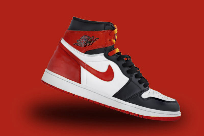
Sure, “Just Do It” was not always the slogan used by iconic sneaker and sporting goods brand Nike. But we have come to know and love that three-word catchphrase since its introduction over 40 years ago as the tag line for an ad campaign launched in July of 1988. Sure, some of us will remember a Nike before “Just Do It,” but I’m pretty sure that the number significantly dwindles when asking who remembers Nike before the unveiling of its famous “Swoosh” logo.
In many publication surveys and rankings, the Nike “Swoosh” is referred to as “the most iconic and creative logo of all time.” However, many do not know that the company we have all become so familiar with for their sneakers and apparel was first founded in early 1964 as Blue Ribbon Sports by the duo of Phil Knight and Bill Bowerman. As irony would have it, Knight, while still a student at the University of Oregon, ran track, and his coach at the school was Bowerman. The ironic twist here that would lead to the iconic Nike “Swoosh” would come after graduation, when Knight, as Bowerman before him, became a college professor.
It was then, at Portland State University, that Knight overheard one of his students, Carolyn Davidson, saying to a classmate that she couldn’t afford the supplies for her oil painting class and offered to help. So Knight asked Carolyn, a graphic design student, to take a job with him to create charts and graphs that he could use for meetings with Japanese footwear executives. She accepted his offer, and her outstanding work would lead to her moving on to make posters, ads, and flyers for Knight’s Blue-Ribbon Sports company. Then, innocently enough, in early 1971, Knight and his partner, Bowerman, would seek a creative logo for a new line of running shoes they had developed. So they went to Davidson because of her exceptional design and graphic skills and tasked her with coming up with the logo, with the simple directions, make it a stripe that can go on the shoes, but make it “have something to do with movement.”
The Logo Study
Davidson would begin her creative logo design process by placing a piece of tissue over a drawing of a shoe, trying to get a feel for how each idea she had would eventually look on the product. In the end, she presented Knight and Bowerman with a logo study that featured five designs to choose from. The co-founders were not strictly sold on any of the five designs she submitted, but production deadlines were looming and rapidly approaching. Infamously, Knight would say, “I don’t love it, but it will grow on me,” when reluctantly deciding on what would become arguably the most iconic brand logo ever crafted.
How to Turn 35 Bucks into Over 32 Billion
The “Swoosh,” as we all have come to know it, that fifth design that Knight “didn’t love,” came out of Carolyn’s creative attempt at mimicking the “line” she was told to design so that the end hooked and would look like a wing. As she was told to, her thought process behind this came from research and her desire for the most creative logo possible while having some reminder of movement. Thus, her inspiration for the logo was a tip of the cap to the Greek goddess of victory. That goddess was named Nike.
Sure, “Just Do It” was not always the slogan used by iconic sneaker and sporting goods brand Nike. But we have come to know and love that three-word catchphrase since its introduction over 40 years ago as the tag line for an ad campaign launched in July of 1988.
JUST DO IT
For her time and services in designing the creative logo, Davidson was paid $35. To put that into perspective in today’s terms, that would be the equivalent of only $217 for designing the most recognizable symbol of any business worldwide. Not to mention, on the heels of the logo becoming popular and eventually “growing on” Knight, it wasn’t long after the logo submissions from Davidson that Blue Ribbon Sports would also change its name in accordance with the talented designer’s inspiration behind the “Swoosh.”
Thus, on June 18, 1971, the world would first be introduced to the “Swoosh.” In January of 1974, the logo Carolyn Davidson crafted with a Greek goddess in mind and adding a “wing” to a simple line on a rendering of a shoe would be registered with the United States Patent and Trademark Office. As for that inspiration that led to the “wing” on the line? Blue Ribbon Sports officially adopted the name of the “Greek goddess” that was the catalyst behind the “swoosh,” and on May 30, 1971, it became known from that day forward as Nike, Inc.
“The Logo Lady” Cashes in on Her Creative Logo
Oh, and as for those “cheapskates” Knight and Bowerman only paying Carolyn Davidson a measly $35 for developing the most iconic symbol of any business in the world…well, let’s just say they would later make good on what would have been the biggest bargain ever in marketing history. For starters, she would continue working for the company until their design needs grew to where they needed more than a one-person staff to handle the workload. Davidson, at that point, would move on to work on other clients’ needs, but she would be personally invited to a company reception by her former professor and employer, Knight, in September of 1983.
Not necessarily expecting what was to follow, Davidson attended the reception. Once there, she would be presented with several gifts of gratitude and thanks for her creative vision being the force behind what had already in 1983 become an iconic logo. The first presentation given to Carolyn was a box of delicious and fancy chocolates in the shape of the “swoosh” she had sought to make in attempting to design a creative logo some 12 years previously. While everyone has a “sweet tooth,” the two gifts to follow would undoubtedly prove “much sweeter” in the overall scheme of things and Davidson’s life. Present number two? Well, that was a fabulous diamond ring made of gold and engraved with the “swoosh.” Finally, the third gift was the one that would be the actual financial “payback” or compensation, let’s say from Knight to his former student. That was an envelope, which inside carried 500 shares on Nike stock.
To put into perspective what type of payday that equals, as of 2015, it was estimated that Davidson’s 500 shares would be worth $ 1 million. That same stock valued at a million would go then in 2016 split into 32,000 shares. So, yeah, the initial recipient of $35 for crafting the most significant and maybe the most creative logo of all time did “get paid” some twelve years later. Unlike her reasoning for taking her former employer upon his initial job offer, it’s safe to say that she was not worried about being able to cover the costs of any oil painting classes after this reception. Carolyn actually would speak of her ex-professor’s generosity in having her at that September 1983 reception.
“That was something rather special for Phil to do because I originally billed him, and he paid that invoice,” she said, recalling the $35 payment received. In addition to the well-deserved compensation from the company, it was also at this point that she had earned a new nickname that would stick. The name, fittingly enough and much like the global icon of a logo she created many years ago, was pretty simple. But from there on out, she would become known as” The Logo Lady.”